
Design Systems + Developer Tools
Creating a scalable design for CSX applications
OVERVIEW
Embarking on my professional journey in 2014 at CSX, I was entrusted with the pivotal task of implementing the creation of a scalable design system for CSX applications.
This collaborative effort brought together diverse talents from design, engineering, and product teams. Over the course of seven dynamic years, my role organically evolved into that of Director of Digital Experience, with design system firmly entrenched within my portfolio of responsibilities.
The CSX technology teams had acquired several applications along the journey of mergers and acquisitions which led to various user experiences and UI’s for applications.
The goal of the design and UI development team was to implement a design system that could streamline application development to create a better user experience.
USER PROBLEMS
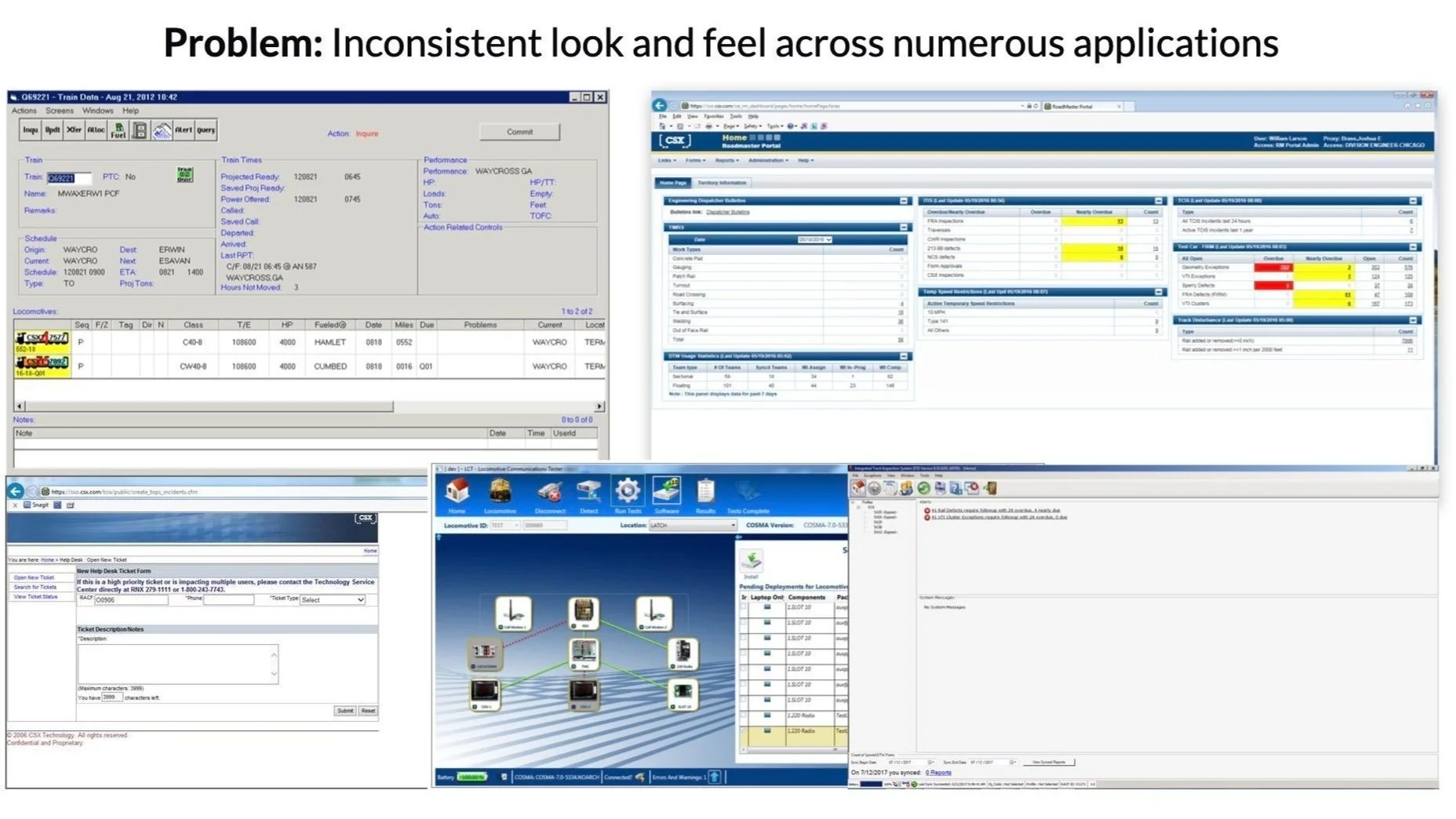
Inconsistent look and feel
Without a standardized design system in place, applications exhibited an inconsistent look and feel. This resulted in stark variations across elements such as search/navigation patterns, icons, and labels, even when presenting identical data.
Heavy cognitive load
Rail employees, tasked with accessing multiple applications concurrently, encountered the challenge of adapting to divergent user interfaces. This constant transition between apps led to prolonged processing times and heightened confusion.
Development challenges
Developers faced the dilemma of duplicating outdated code and branding, or incorporating non-standard design patterns that detracted from user-friendliness when creating or updating applications.
GOALS & OBJECTIVES
Create a consistent UI
Improve ease of onboarding employees
Expedite development
Improve Code Quality
Approach
-

1. Goals + Audit
First, I defined the purpose and objectives of the design system by consulting with key stakeholders, including designers, developers, and product managers. This helped us align on the need to improve brand consistency, accelerate development workflows, and enhance user experience across all touchpoints.
Next, the team conducted a thorough design audit of existing creative assets, gathering insights into what was working well and where inconsistencies existed. This included reviewing UI components, typography, color schemes, and iconography across our products. I also solicited feedback from team members to identify opportunities for improvement.
-

2. Guidelines + Component Library
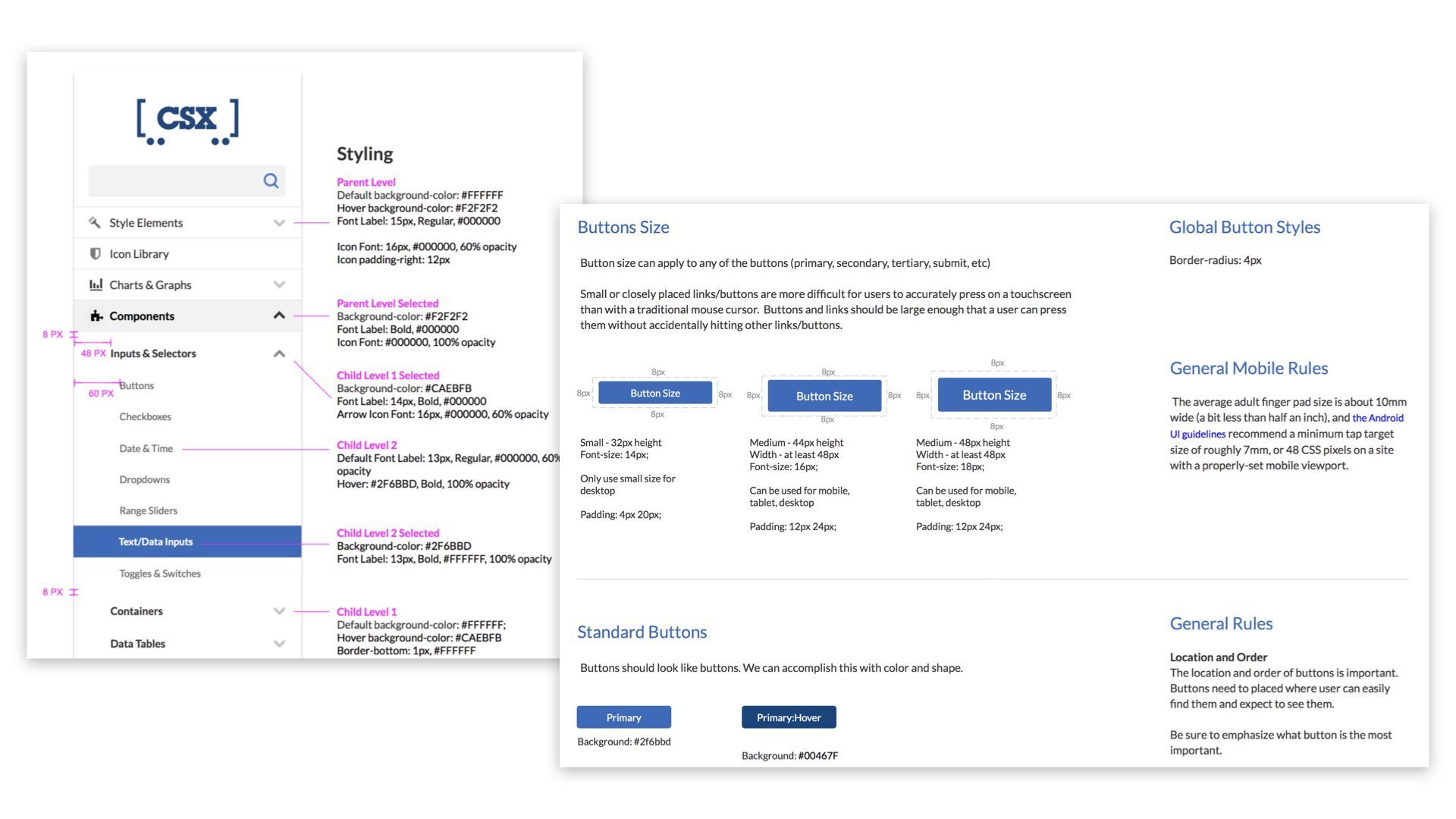
With a clearer understanding of our existing assets, I worked with the team to establish a set of core design principles. These principles focused on accessibility, scalability, and brand alignment. We defined our brand standards for color, typography, iconography, and usage guidelines to ensure consistency across components.
We developed our component library in Axure, where we housed reusable UI elements such as buttons, forms, and cards. Each component was documented with detailed specifications on its purpose, interaction states, accessibility requirements, and usage guidelines. Axure allowed us to create interactive prototypes, which helped in testing and validating components before implementation.
-

3. Documentation + Collaboration
To house all documentation, I set up a Confluence page within the Atlassian Tool Suite. This centralized platform was crucial for providing easy access to our design system guidelines, component specifications, and best practices. We also linked this Confluence page to our CSX Showcase website, making it readily accessible for anyone in the organization to reference.
Collaboration was key to our success. engagement occurred with the designers, developers, and product managers early and often. We tested components in real scenarios and iterated based on feedback, ensuring that each element met the needs of various stakeholders. Regular check-ins allowed us to address any challenges quickly and refine components based on user and team feedback.
-

4. Governance + Adoption
We implemented a governance model to maintain the design system and manage updates. I worked with the UI Architect to set up a contribution process to allow team members to propose new components or modifications. This included a review and approval workflow to ensure that all updates aligned with our design principles and standards. Regular reviews and updates were also scheduled to keep the system up-to-date with evolving needs.
Finally, to encourage adoption, I organized training sessions and workshops called UX University to help team members understand the design system and integrate it into their workflows. We also provided ongoing support through a dedicated Confluence page and communication channels, allowing the team to ask questions and share feedback. This helped create a culture of continuous improvement and ensured the design system was effectively utilized throughout the organization.
CSX Design System + Developer Tools
Note: This is a sample and not a complete view of the design system
CSX Showcase
We introduced the design system through an app called the CSX Starter Showcase, a single source to view patterns, icons, styles, code snippets, and links to documentation.
Our system hierarchy consisted of:
COMPONENTS - Basic UI building blocks of our user interface (the smallest functional unit).
MODULES - Groups of two or more components combined together to function as a simple or complex unit. The UX team created a collection of custom modules tailored for our rail applications.
PAGE TEMPLATES - Pre-designed pages containing the structure and interaction design for common layouts and design patterns.

Accessibility
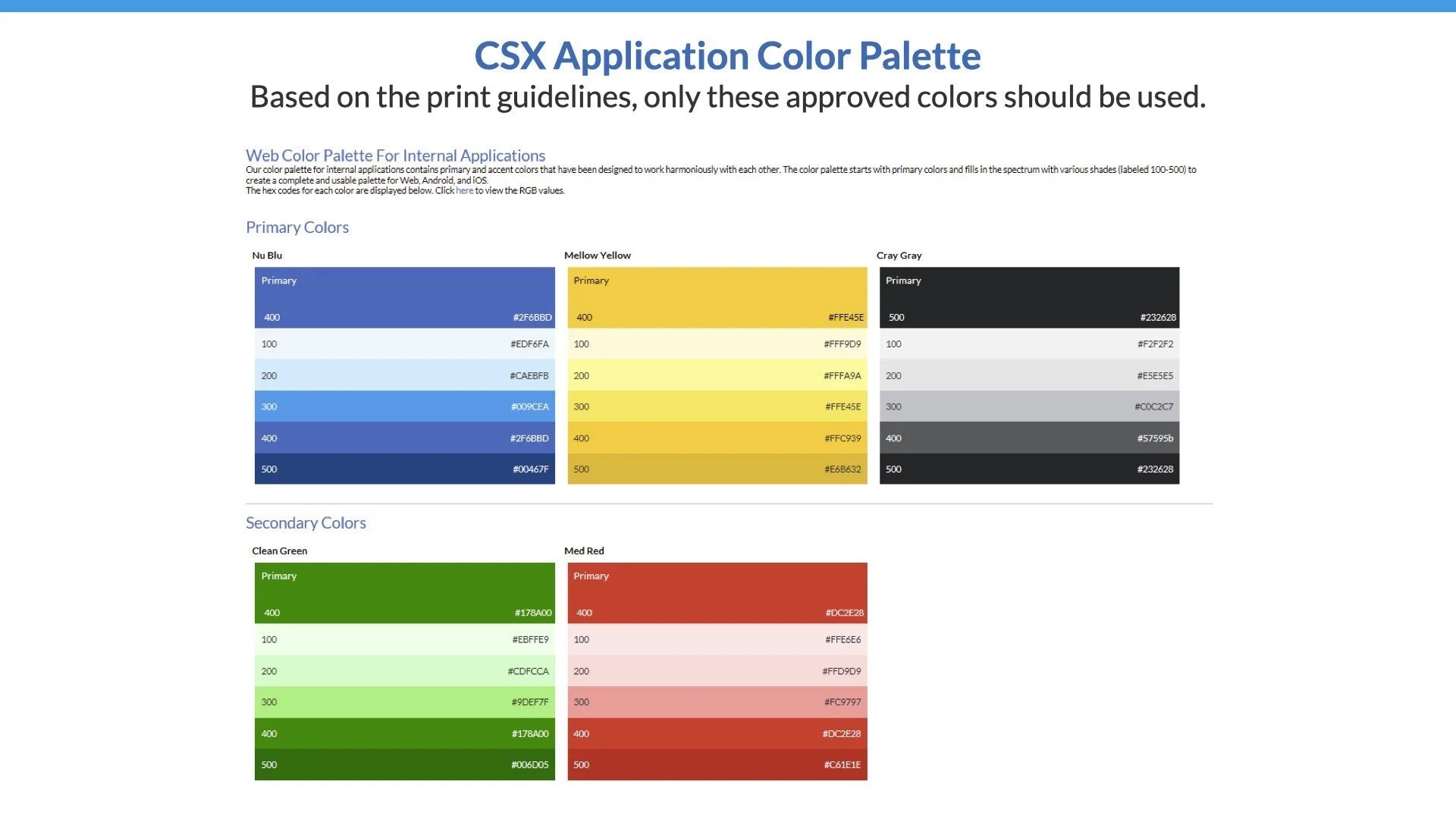
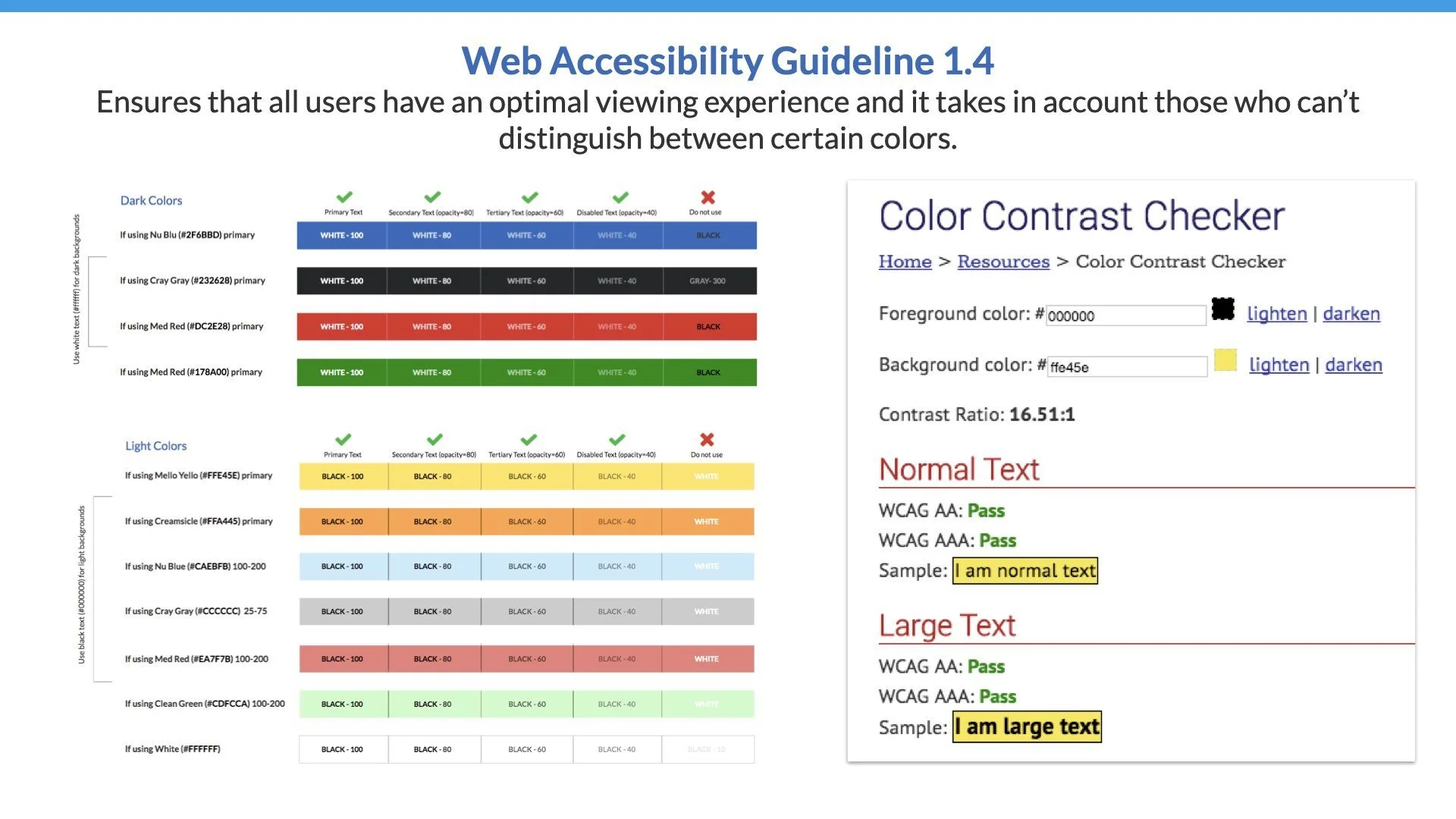
Accessibility & Color
In my capacity as a design leader, I led the effort to ensure an exceptional user experience for all individuals, particularly those with visual impairments, such as color blindness. Leading my team, we meticulously integrated web accessibility guidelines into the development of a standardized color palette. This initiative not only enhanced inclusivity but also underscored our commitment to delivering accessible and user-centric design solutions.
Iconography
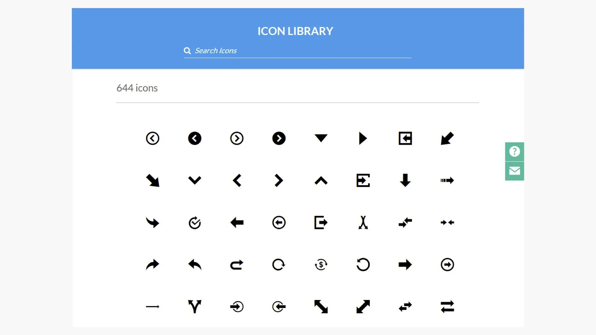
Icon Library
The CSX Showcase included a comprehensive searchable icon library comprising over 600 icons. Developers could easily locate their desired icon and copy a code snippet for insertion into their application.
These icons were meticulously designed using Adobe Illustrator and exported as SVGs for inclusion in the library. Furthermore, we incorporated metadata for each icon, enabling efficient search functionality.
Standardized App Icons
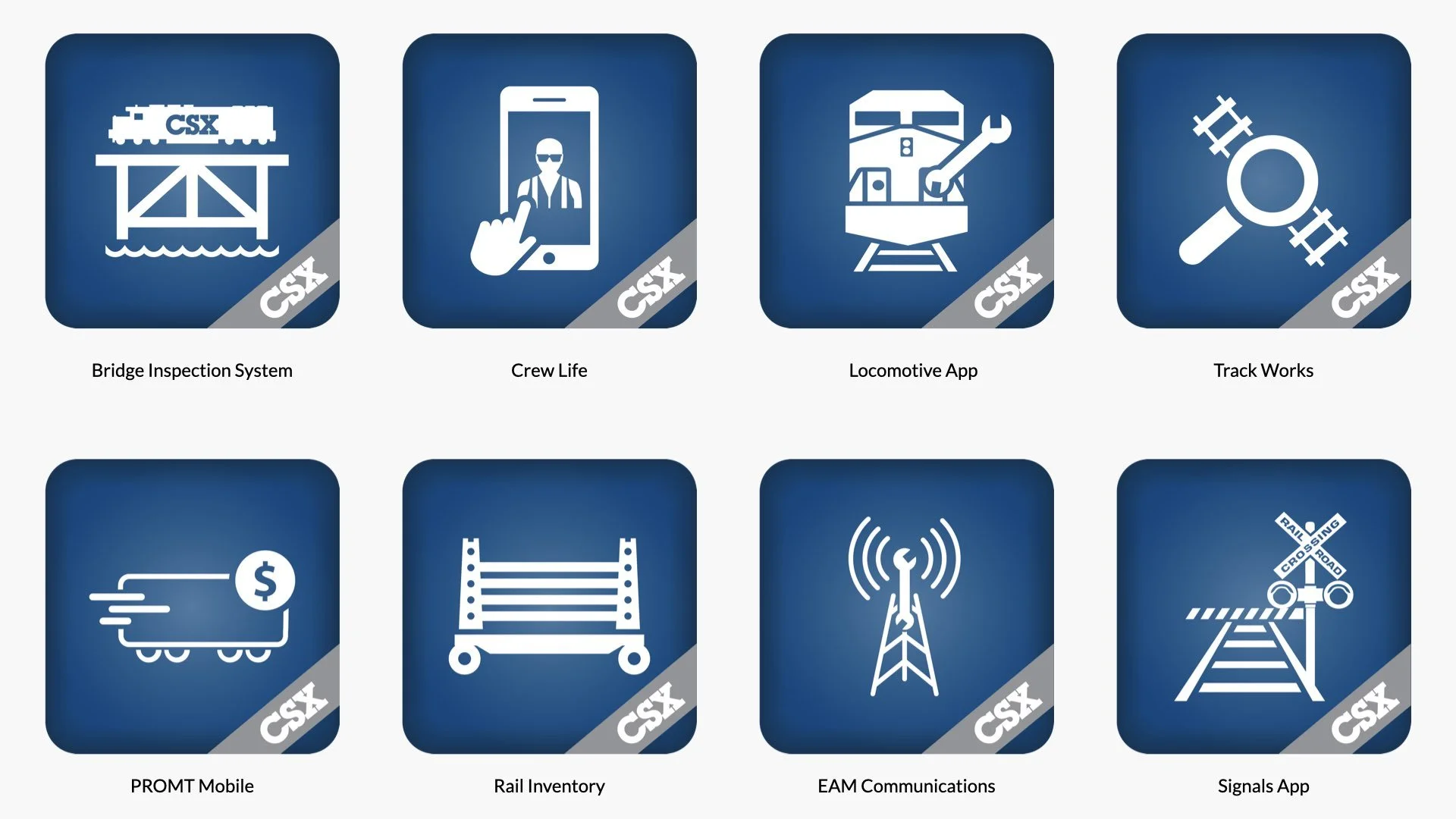
Prior to the design system, mobile apps deployed to the app store did not have consistent branding. A template to standardize app icon designs was created and revamped 30+ existing icons with the enterprise.
Styling Examples
As a design leader, I orchestrated the creation of the CSX Showcase layout and navigation prototype using Axure, guiding my team through the design process. Additionally, design crafted a comprehensive style guide encompassing multiple reusable components. Our engineers utilized this guide as a reference point during the construction of the CSX applications, ensuring consistency and efficiency throughout the development phase.


Custom Components
As a design leader in a complex application environment, I recognized the necessity of custom components for certain situations, although they were not the standard practice.
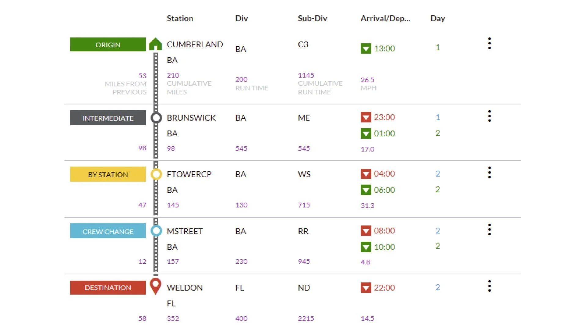
In addition to employing common design patterns, our UX team developed custom modules specifically tailored for our rail applications. One such module, visualizes train routes across different station types, incorporating key data points preferred by end-users. This versatile module could be seamlessly implemented across various applications requiring the display of train route data. This saved time and reduced the need to utilized multiple applications to retrieve data.

Organization Impact
“[In the past] I would have budgeted a good two weeks of startup time as my newer resource worked with a senior developer to get set up. Not only did the showcase increase our “speed to market” by enabling my new team member to get started immediately, it also eased the workload on the rest of my team.”
Alissa H., Sr. Project Mgr I
“Using the Showcase drastically lowered the development time. The ability to have access to the code snippets helped immensely. Being able to directly see what a piece of code should look like and make minor adjustments to mold the components to your liking made building the pages a breeze.”
Aldrich Ruiz, Software Engineer